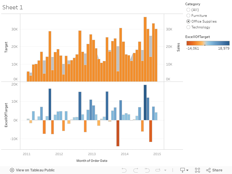
We have the data from a departmental store. The CEO wants to see how the 3 main departments are performing. So we create a dashboard giving him the summary of the same for the last few years.
Top half shows a bar chart of the sale with a grey area chart of the corresponding target in the backgroud.
Bottom half show the value of sales - target, and it is color coded! Darker the blue, better the result :)
This should give an insight on the sales performance of each department, giving us the absolute trends. Also, we can define the targets better using this data.